Pie Charts
A survey of a group of 360 people shows the brand of handphones they use. The results of the survey are presented in the table below.
Handphone brand |
Apple iPhone |
Samsung |
Google Pixel |
Others |
No handphone |
Number of people |
90 |
180 |
36 |
45 |
9 |
From the above, the fraction of the group that uses:
Apple iPhone:
=
Samsung:
=
Google Pixel:
=
Other handphones:
=
No handphone:
=
Now, let's take all these fractions and present them in a more readable form so they are easy to compare. We'll use what we call a pie chart as below.
Apple iPhone:
| 90 |
| 360 |
| 1 |
| 4 |
Samsung:
| 180 |
| 360 |
| 1 |
| 2 |
Google Pixel:
| 36 |
| 360 |
| 1 |
| 10 |
Other handphones:
| 45 |
| 360 |
| 1 |
| 8 |
No handphone:
| 9 |
| 360 |
| 1 |
| 40 |
Now, let's take all these fractions and present them in a more readable form so they are easy to compare. We'll use what we call a pie chart as below.
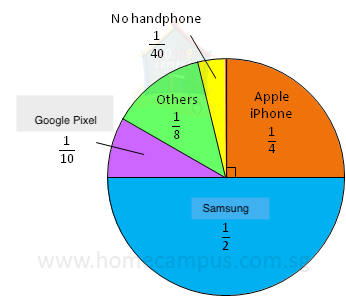
The above circle graph known as a pie chart shows the popularity of handphone brands among the group.
Now, let's answer some questions based on the above pie chart.
a) Which was the most popular handphone brand? Explain.
Samsung; because it got the biggest pie in the pie chart - half the pie.
Samsung; because it got the biggest pie in the pie chart - half the pie.
b) What percentage of the group used the Apple iPhone?
1 whole pie = 100%
of a pie = 25%
25% of the group used Apple iPhone.
1 whole pie = 100%
| 1 |
| 4 |
25% of the group used Apple iPhone.
| 1 |
| 4 |
c) How many times as many people used Samsumg handphones as compared to those who used Apple iPhone?
Samsung -->
Apple iPhone -->
÷
=
×
= 2
2 times as many people used Samsung handphones as compared to those who used Apple iPhone.
Samsung -->
| 1 |
| 2 |
Apple iPhone -->
| 1 |
| 4 |
| 1 |
| 2 |
| 1 |
| 4 |
| 1 |
| 2 |
| 4 |
| 1 |
2 times as many people used Samsung handphones as compared to those who used Apple iPhone.
d) What percentage of the people surveyed used Google Pixel?
× 100% × 10%
10% of the people surveyed used Google Pixel.
| 1 |
| 10 |
10% of the people surveyed used Google Pixel.